Seat 61
—
Year: 2026
Output: Visual identity, Website
Sector: Travel
“Seat61.com is not a company or a travel agency, but a personal site originally started as a hobby by Mark Smith. Travelling by train from London to mainland Europe is a much more practical option than most people imagine. But finding out about it has become frustratingly difficult. I thought I could post basic 'how to' information online for train journeys from the UK to Italy, Spain, Switzerland, Greece, Russia and every other country in Europe.” — Mark Smith.
The 2 objectives for this self initiated exercise were to:
- Create a consistent visual system
- Improve the digital experience
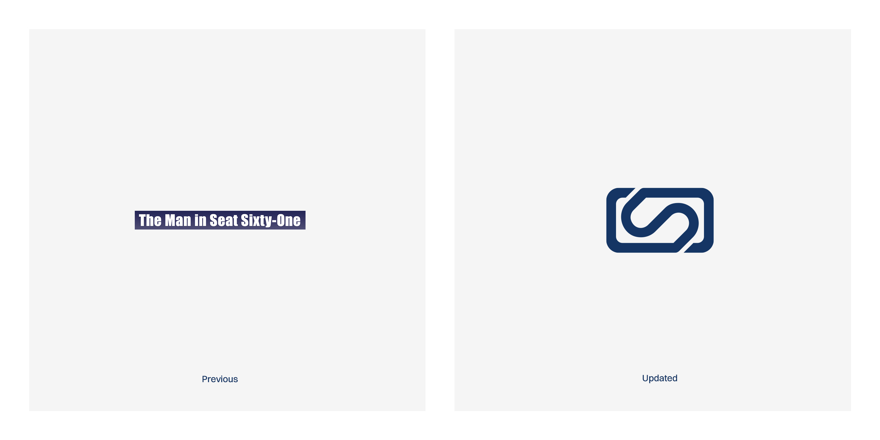
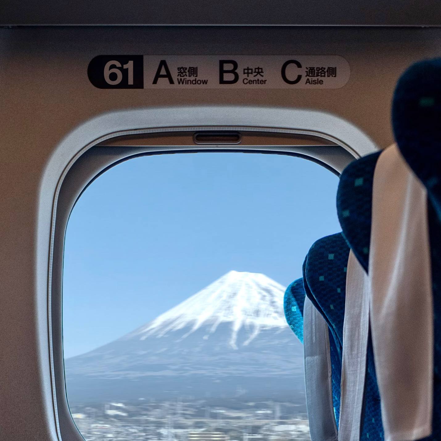
Changing between ‘Seat 61’ and ‘The Man in Seat Sixty-One’ interchangeably across their touchpoints provided a disconnect from the entity. I wanted to develop an ownable identifier that could be immediately recognisable and also remove the disconnect by making every written touchpoint simply ’Seat 61’ given the equity already in place with their website URL and social media handles. This has the added benefit of making it more inclusive and personable, as everybody can be the “man” in Seat 61 on their own journey or adventure.
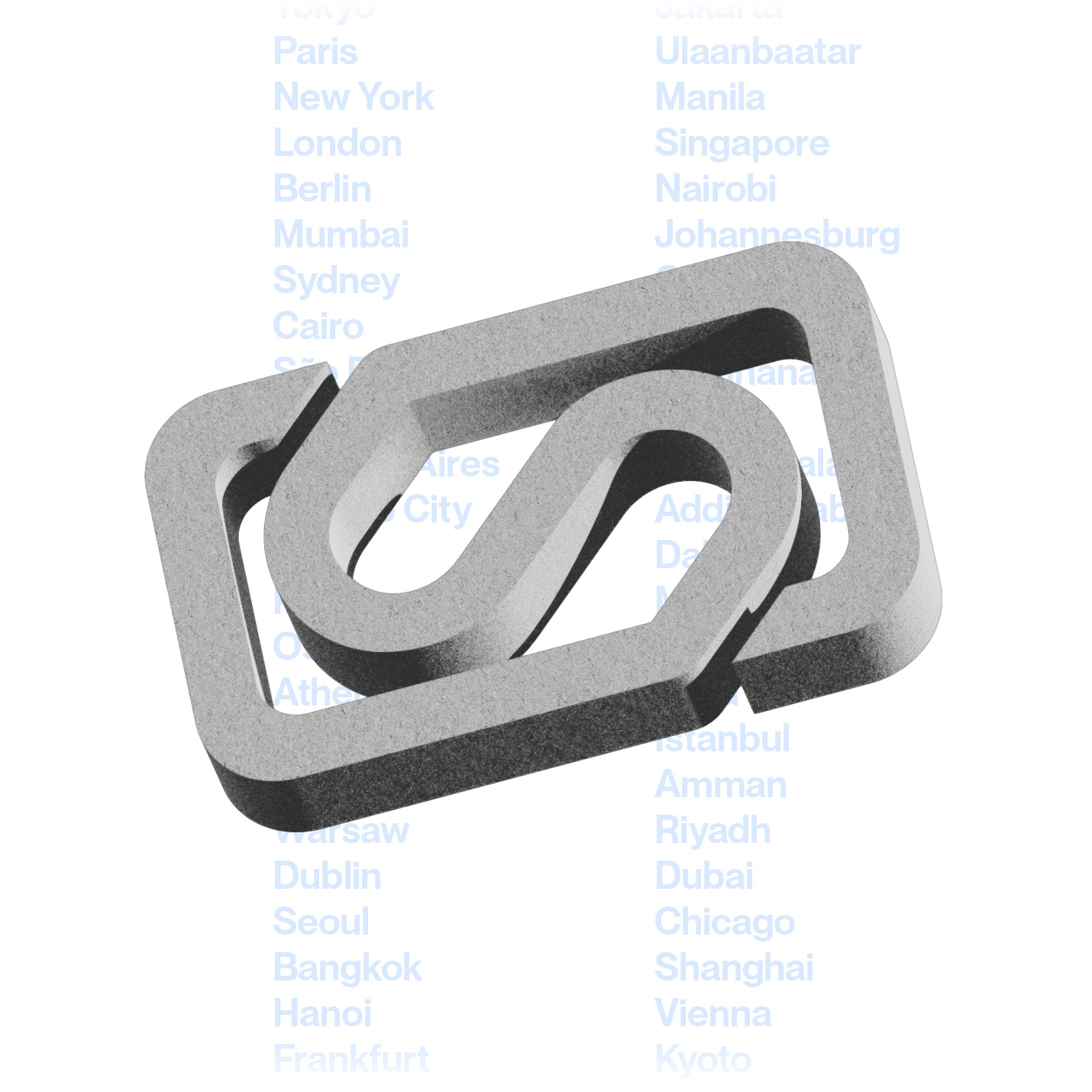
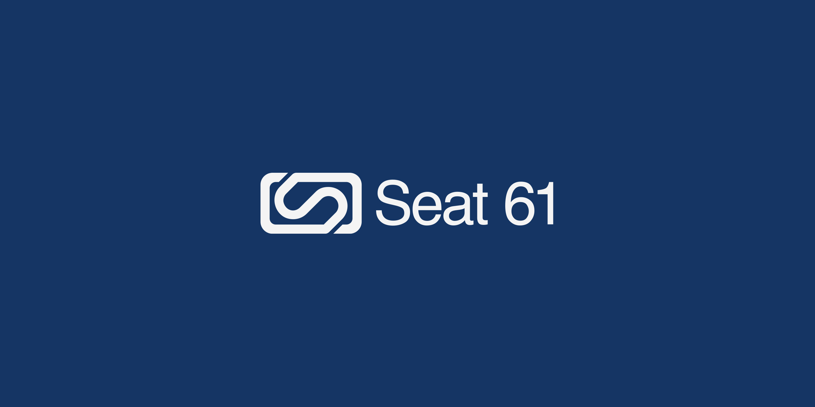
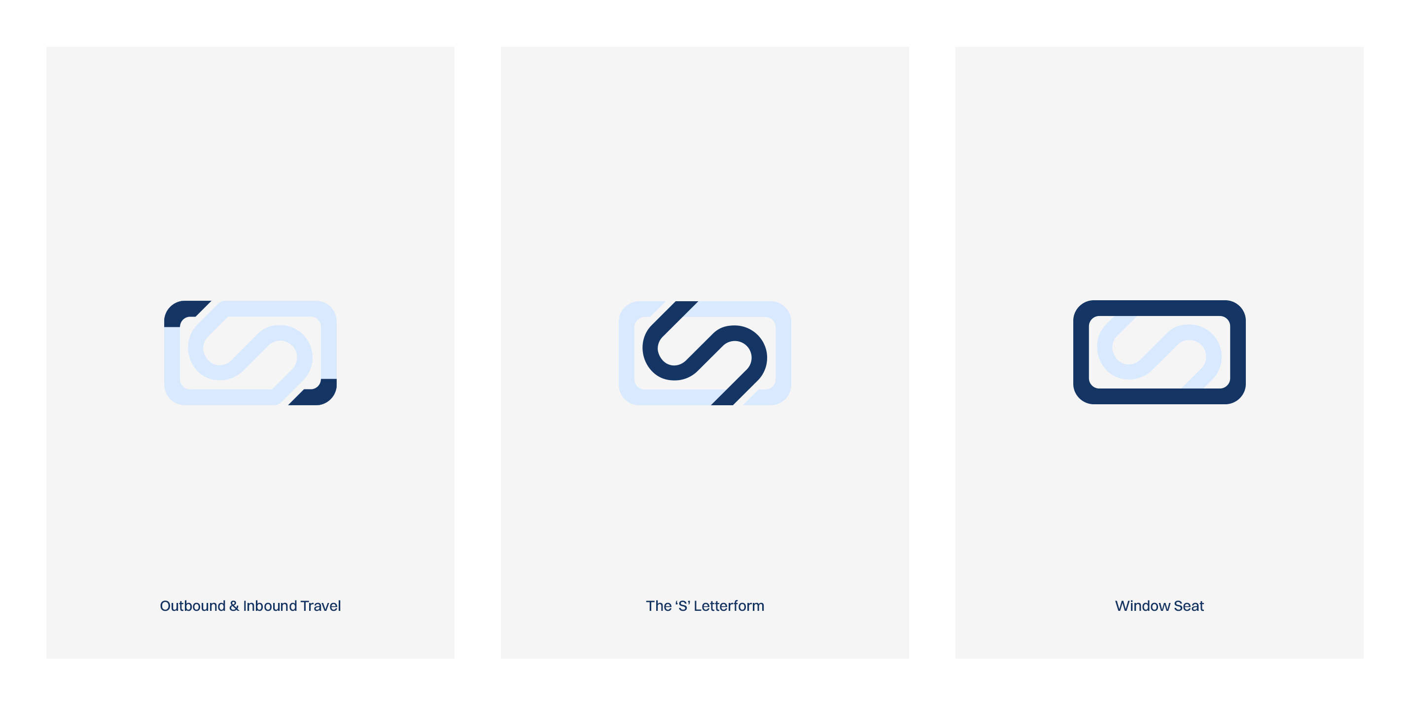
The challenge was to create a logo that would act as a minimalist anchor, understated and friendly yet not too abstract to the point of being sterile. During preliminary research and development, I was drawn to the idea of incorporating a window frame and the letter ’S’. When combined, they had the potential to offer a logo mark that could do a lot with a little. After multiple rounds of iteration, I landed on these key elements within the logo mark.
Outbound & Inbound travel
The ’S’ Letterform
Window frame
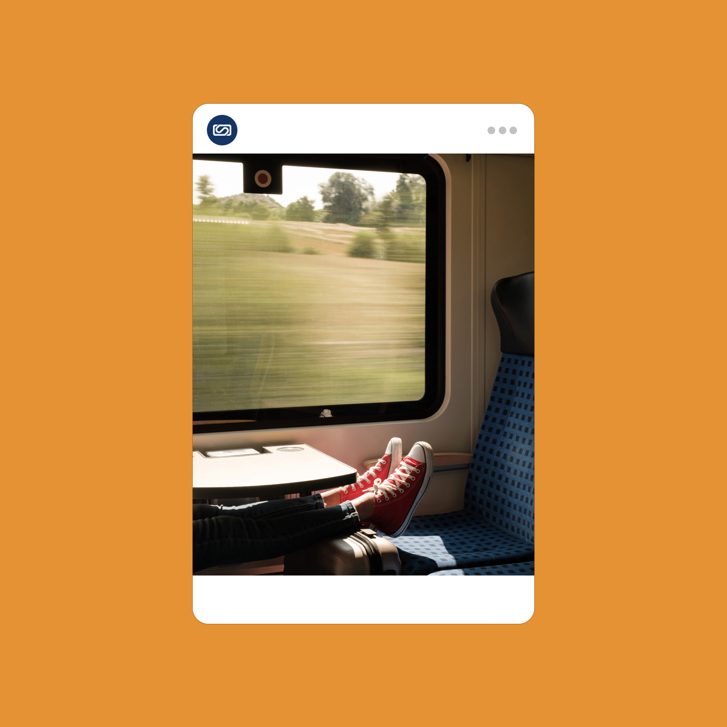
The fourth element would be personal interpretation due to the nature of the abstraction. Does the ’S’ just signify “Seat” or are you on the Glacier Express looking out of your window and seeing the many carriages snaking behind you? Are you crossing a bridge looking out of your window and seeing a meandering s-shaped river? Or is it topographical and a very abstract vision of undulating mountains, your next adventure perhaps?
The 45° angle is forever present across the visual system and is a subtle nod to railway and subway visual communication around the world.
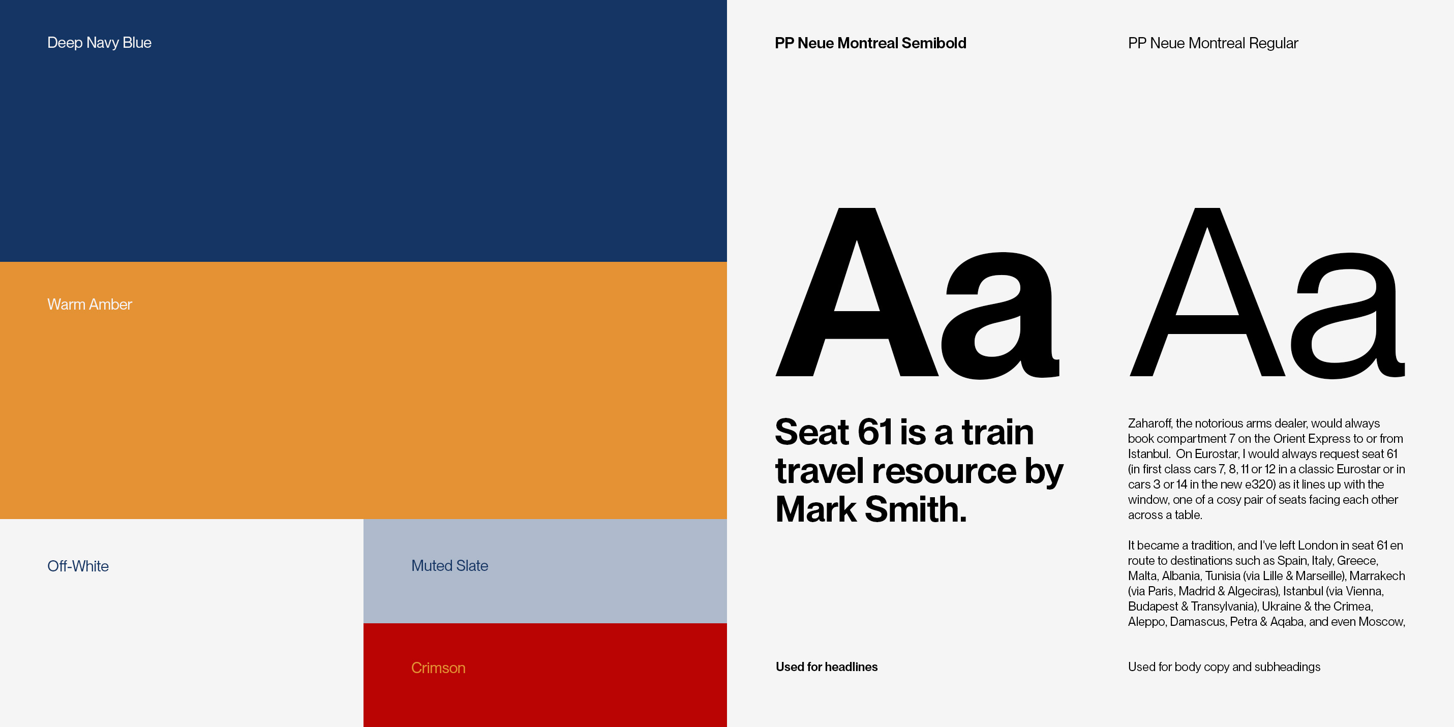
There was no real identifying colour palette nor identifying typography to associate with Seat 61. The previous incarnation had a blue that I felt was a bit too dark; something lighter and combined with a complementary palette would allow the identity to feel fresh, friendly, familiar, and aesthetically appealing. The primary colour is now a navy blue supported with a warm amber. Two further colours— muted slate and crimson— give balance and harmony.
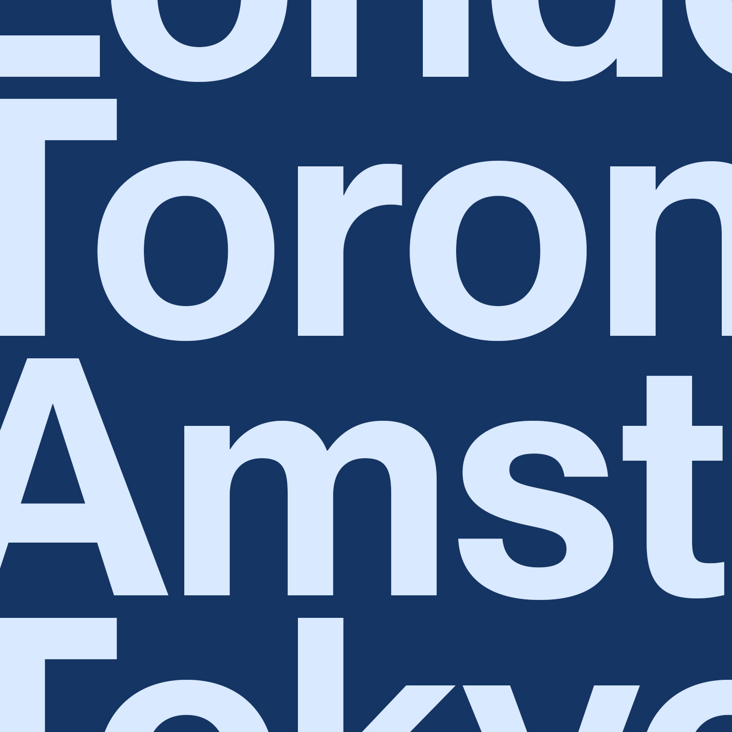
Appearing as a secondary device, the logotype is set using Helvetica, and the typography used throughout the rest of the system for headings and body copy is Pangram Pangram’s Neue Montreal Semibold and Neue Montreal Regular. I wanted something welcoming, practical, very legible, with the ability for clear, distinctive hierarchy.
Both colour palette and typographical choices pay homage to past and present railway liveries and subway systems around the world.
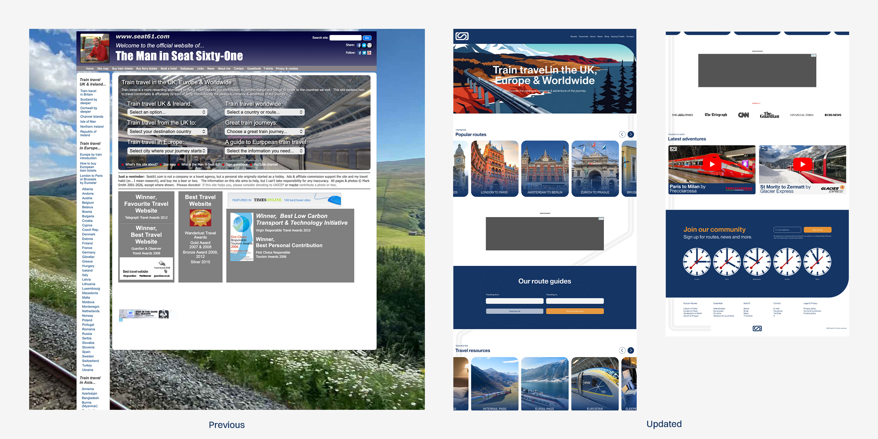
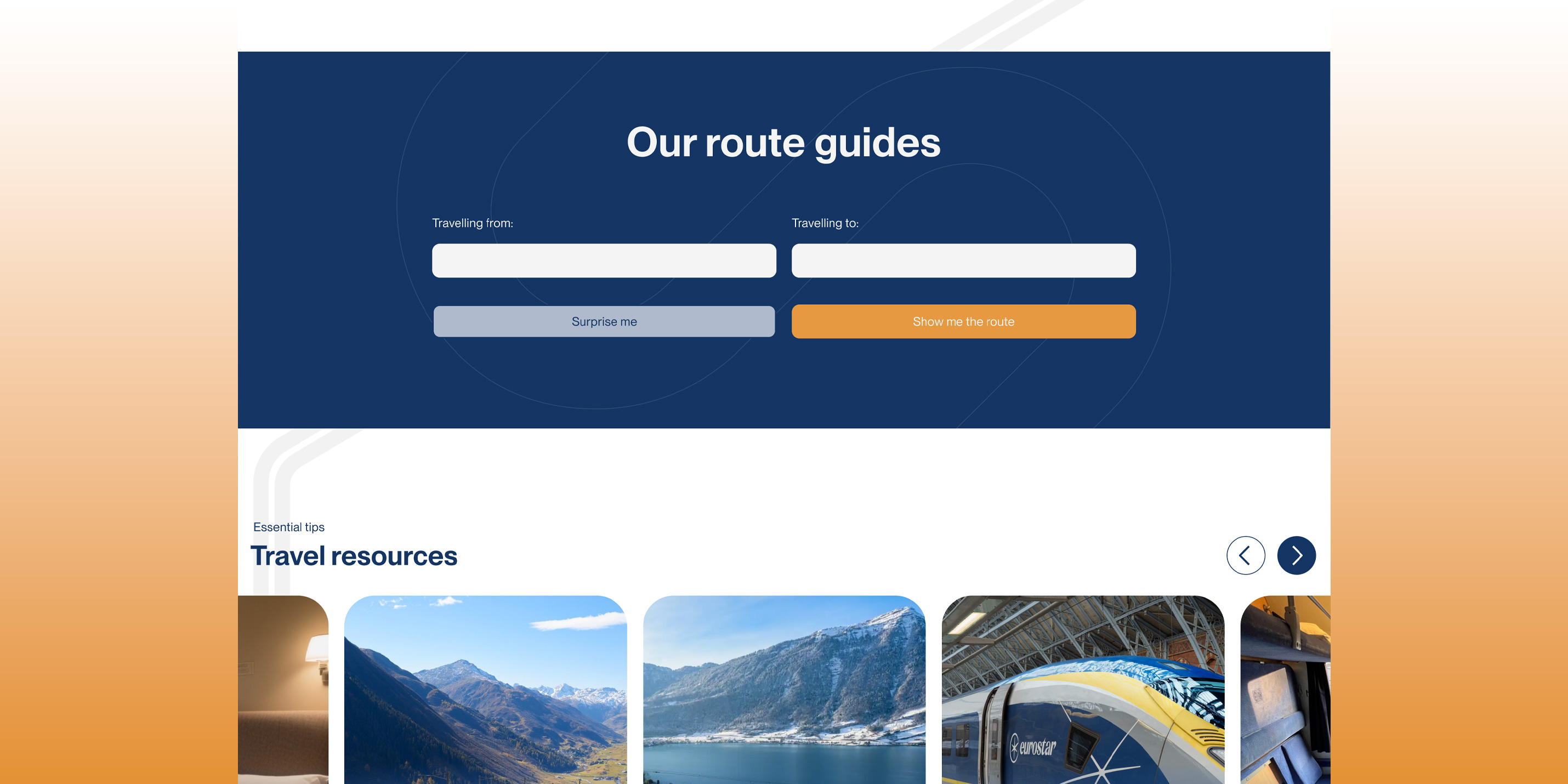
Aside from the challenge of creating a simple logo mark, the biggest motivator was taking the existing website, that felt very outdated to the point of untrustworthy and lacked a coherent hierarchical structure. The solution was to bring the website up to date with modern browsing expectations, make it easier to use and be visually engaging for the reader. It states on their website, “the site aims to inspire people to do something more rewarding with their travel opportunities than schlepping to an airport, getting on a soulless airliner and missing all the world has to offer”. I felt their website didn’t help to do that at all visually. Now, the website feels cleaner and fresher thanks to improved whitespace allowing elements to breathe and flow between sections better and provides easy scanning for the latest route guide or essential resource, as after all it is a blog.
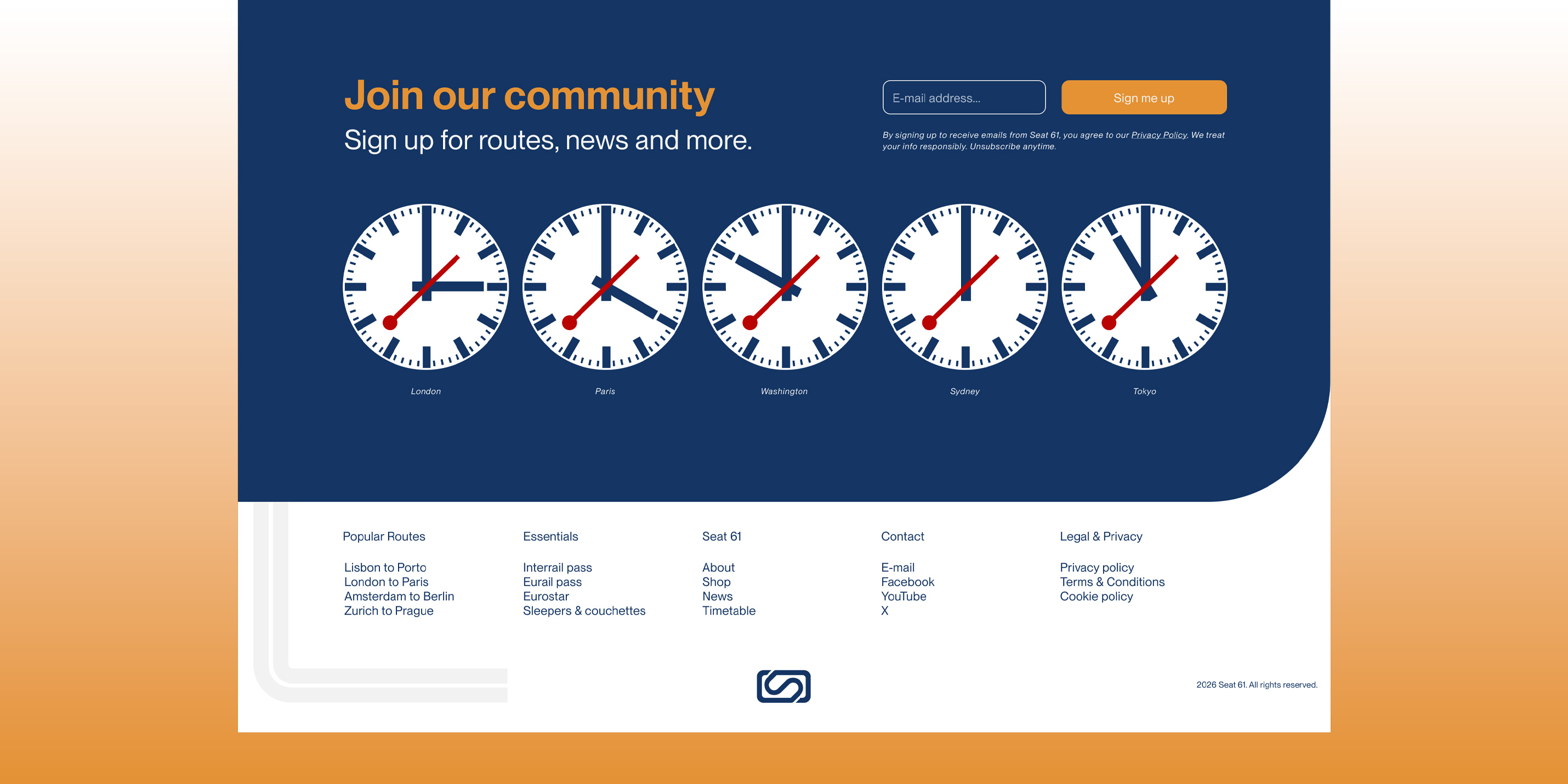
Mainly to express fun and playfulness, at the foot of the website are five active clocks, again paying homage to the design of the famous railway clocks or SBB Bahnhofsuhr found in most Swiss train stations.
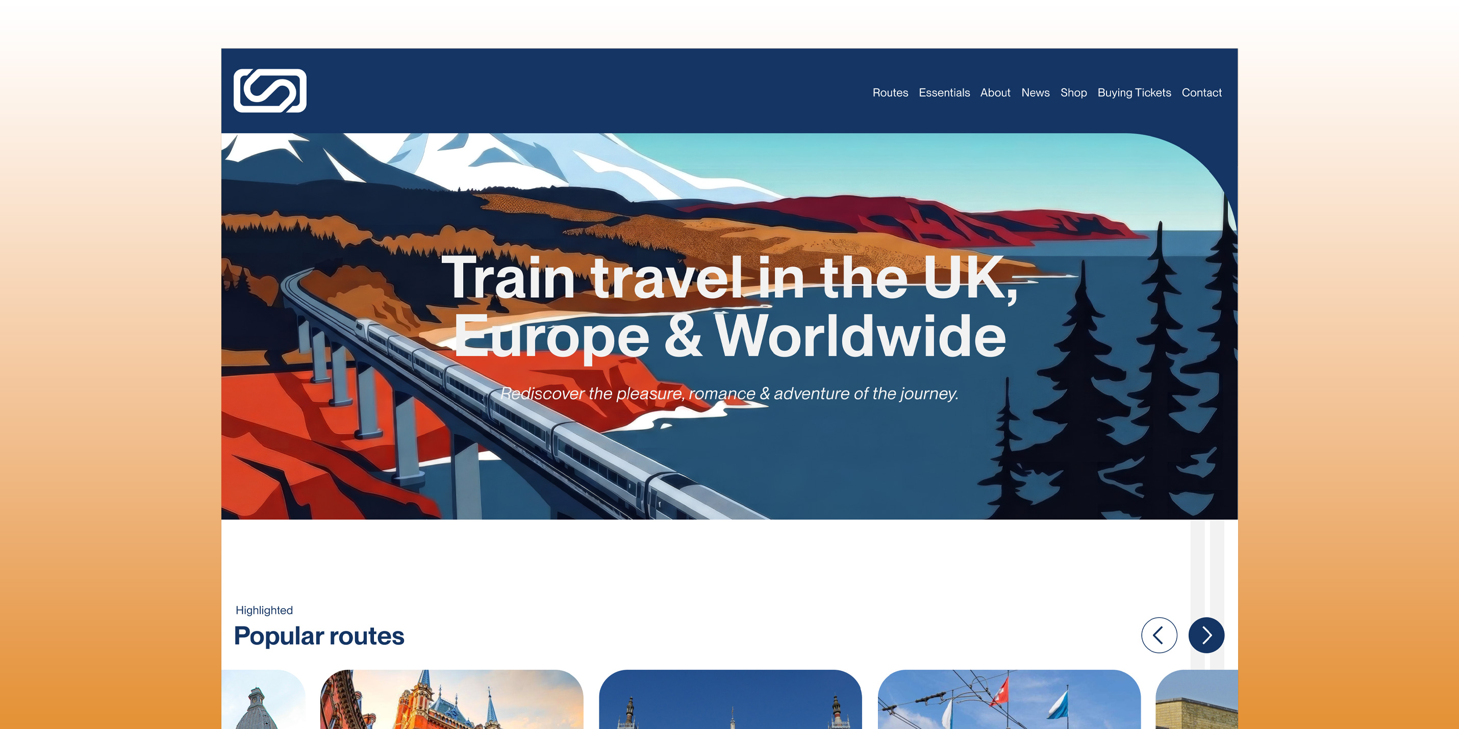
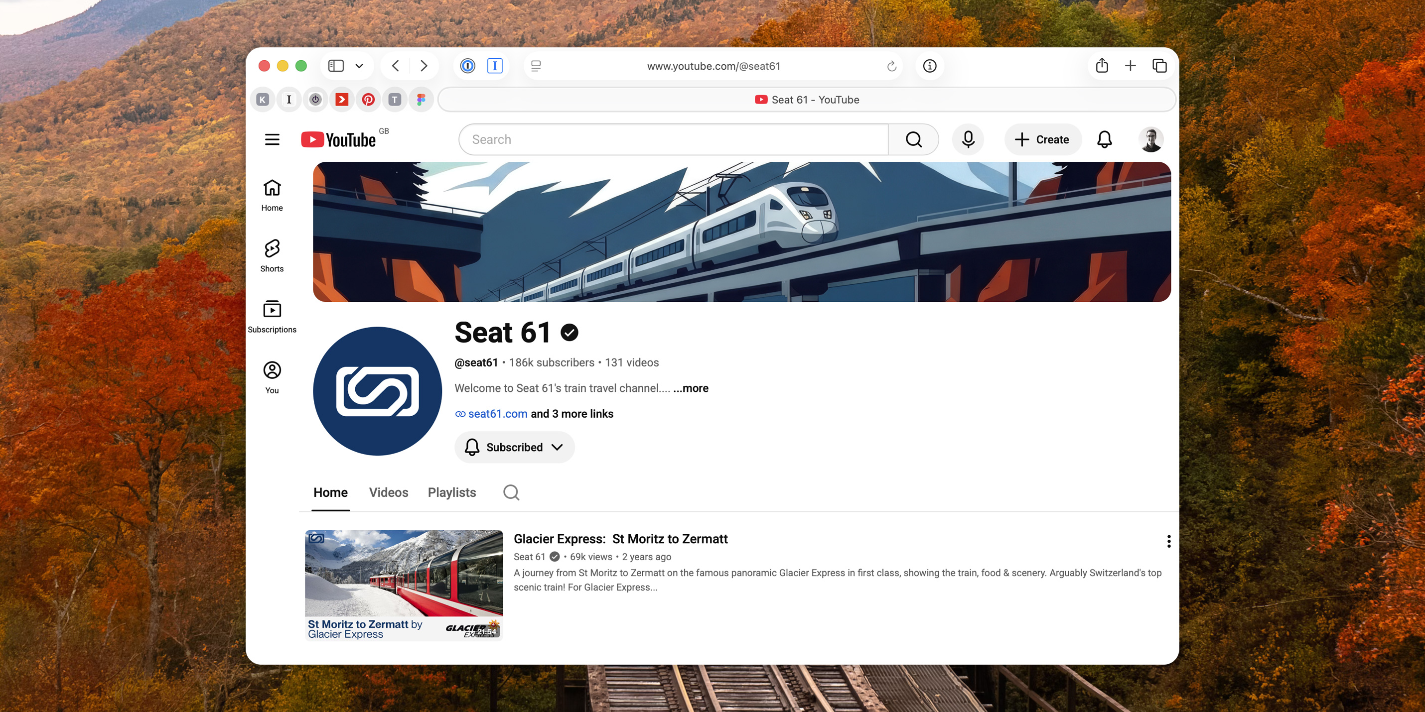
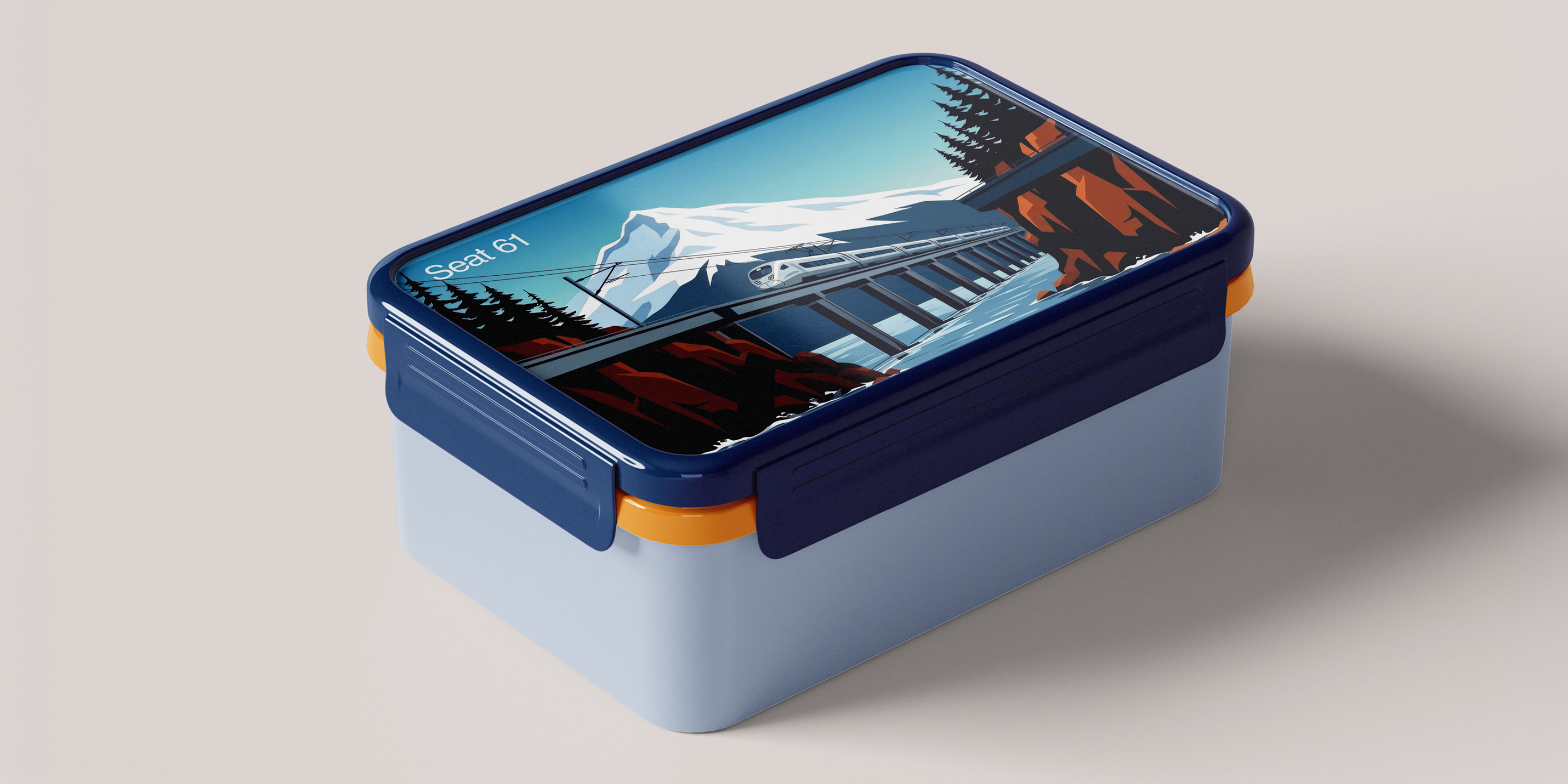
I was drawn to this part-line from Seat 61’s existing website, “…rediscovering the pleasure, romance, and adventure of the journey.” And I wanted to reference it and make it part of the visual language system in the form of vivid retro-esque illustrative adventures traversing different parts of the world via rail. These illustrations would be used as hero images for the website or supplemental imagery on social media such as YouTube banners.
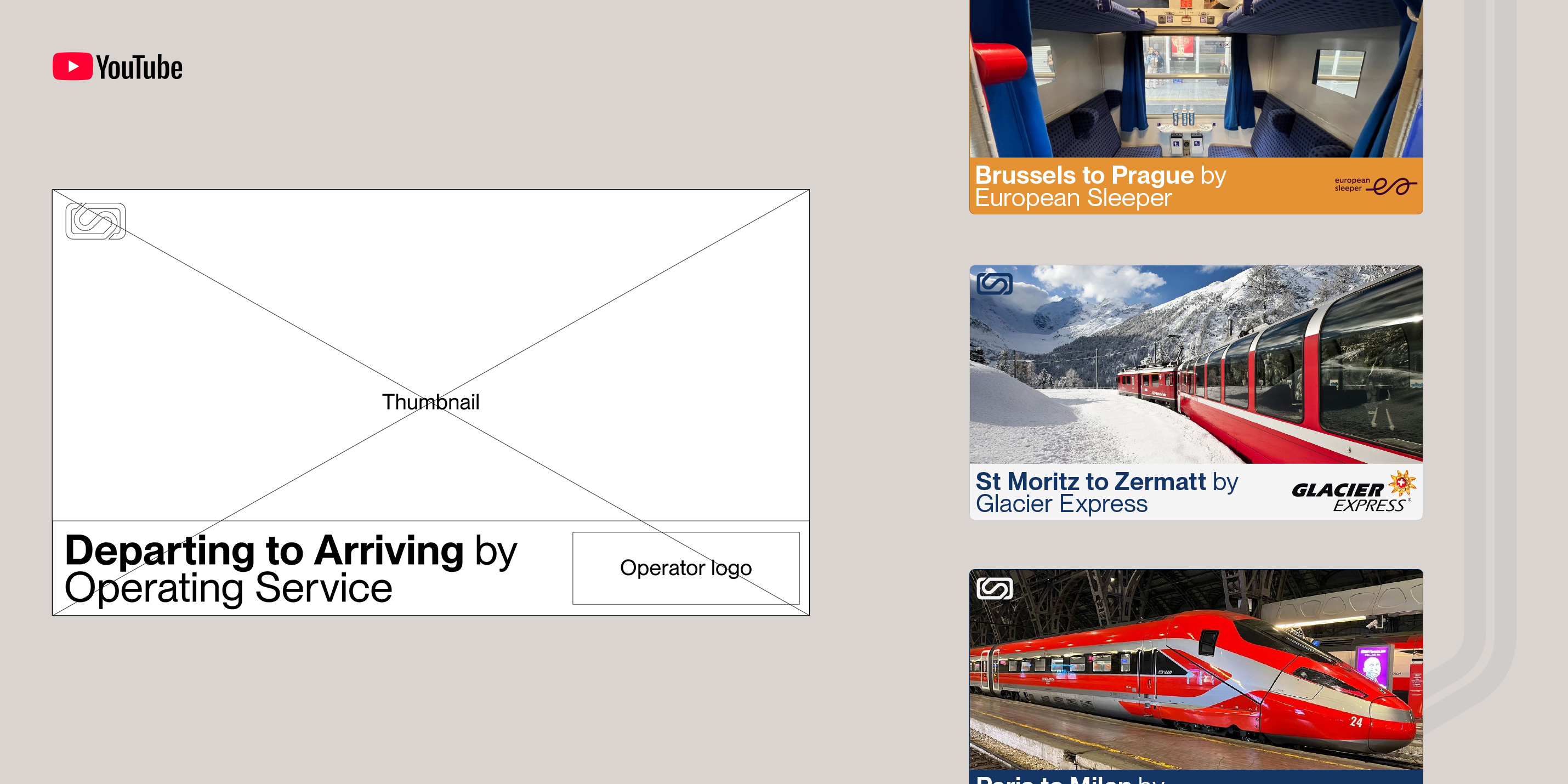
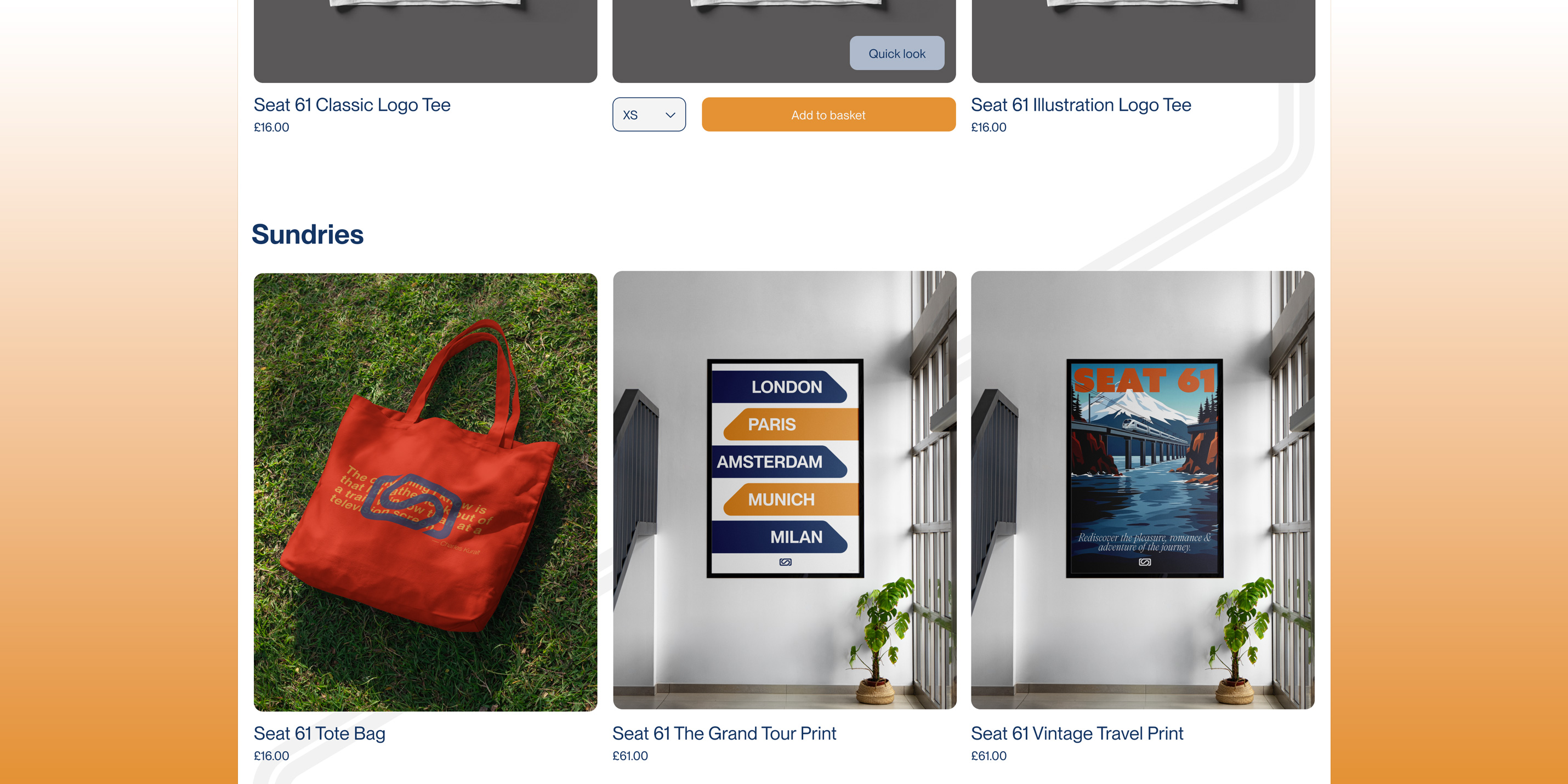
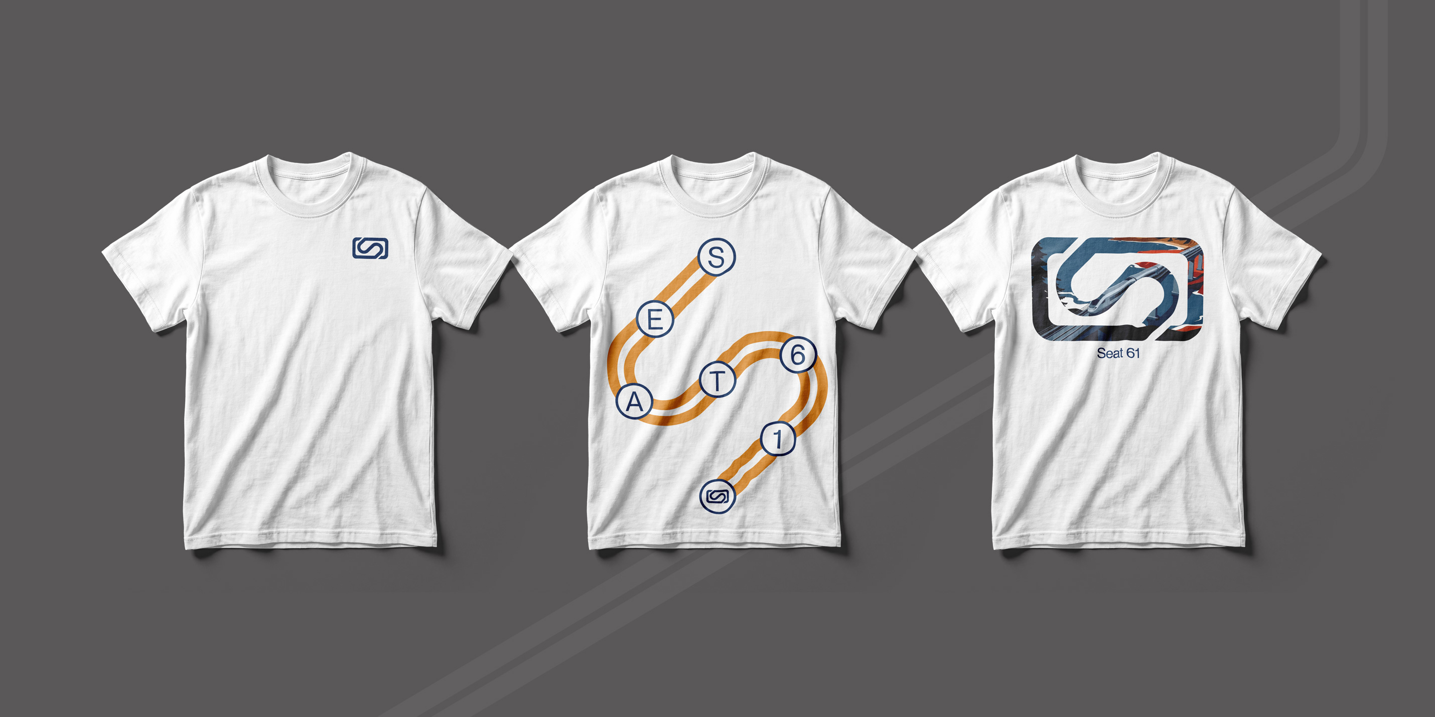
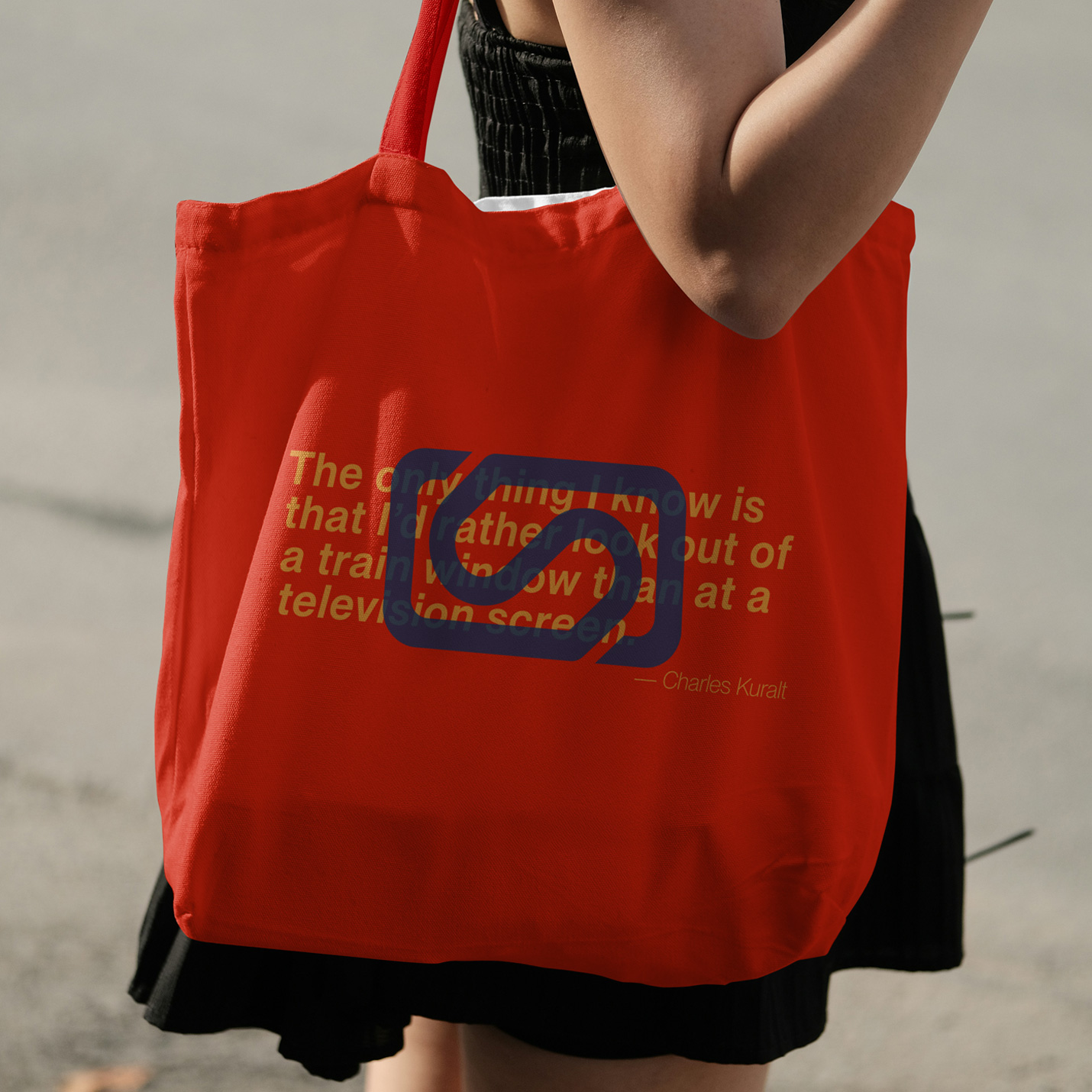
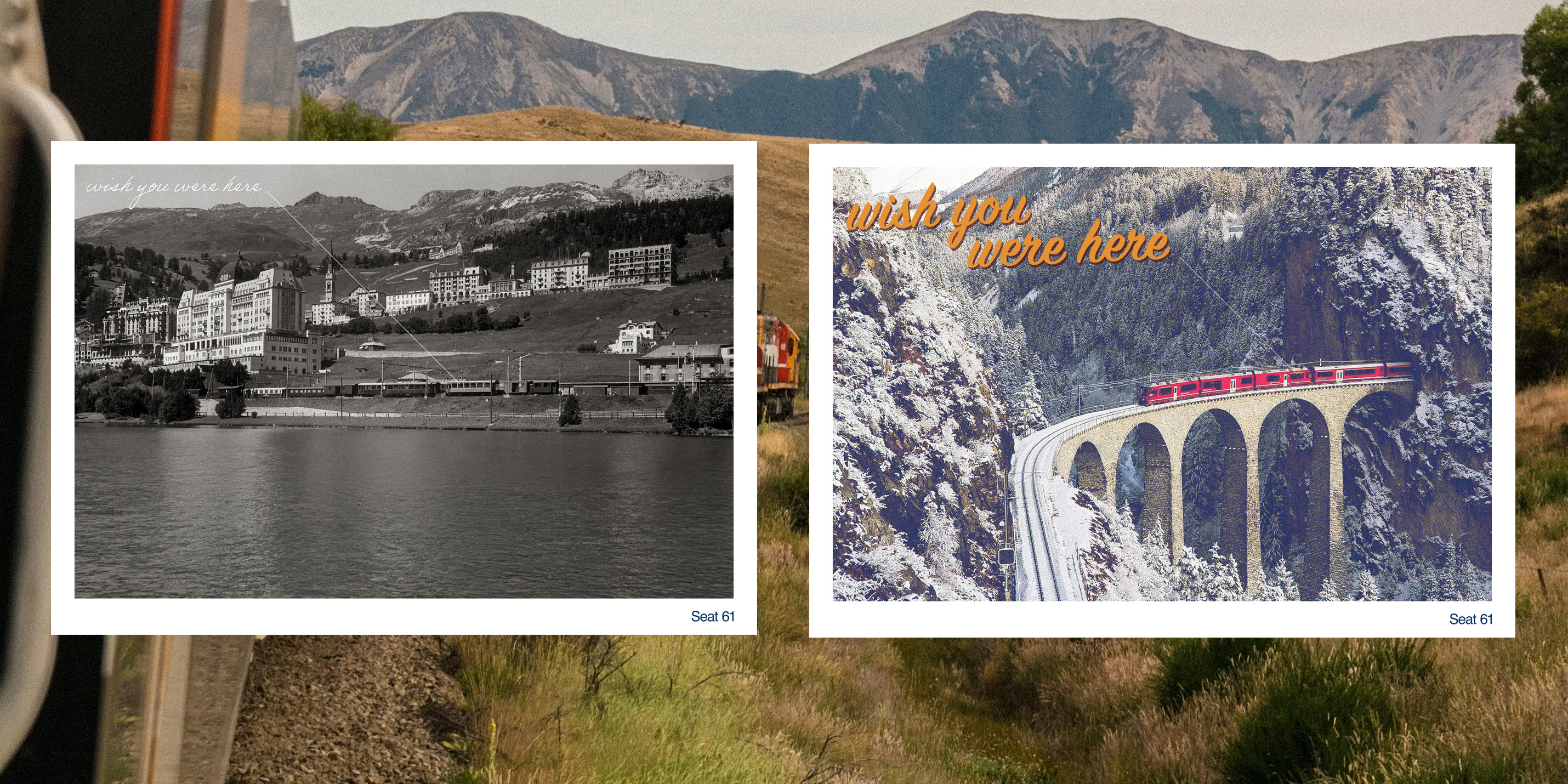
Having now an identifier, a specific colour palette, and typography, gives the flexibility and ability to build a world around Seat 61. Whether that being a template for YouTube videos, expanding out their shop with a new range of merchandise including t-shirts, prints, tote bags, postcards, and packed-lunchboxes. Everything now can be undeniably, unmistakably Seat 61, with the potential to expand it further or to have collaborative partnerships with ease.